Transforming complex medical information into a clear, human-centered experience.
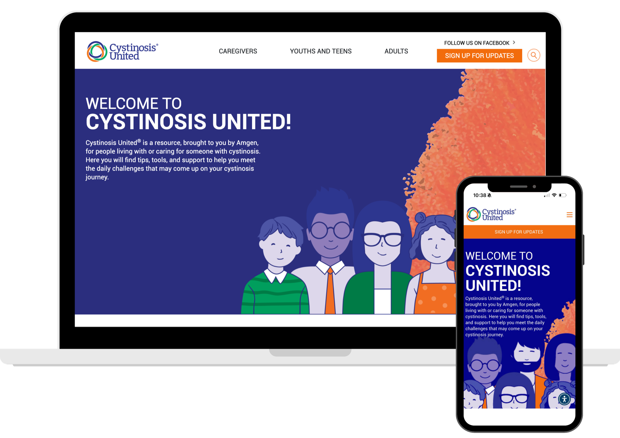
A responsive platform designed to support families, adults, and caregivers navigating cystinosis.
OVERVIEW
Cystinosis United is an educational platform created to help families and individuals understand cystinosis—a rare genetic condition that can feel overwhelming at diagnosis.
My role was to translate externally provided designs into a highly responsive, structured, and accessible digital experience. With over 100 content modules, the platform needed intuitive navigation, strong hierarchy, and interactive elements that simplify dense medical information without losing accuracy or warmth.
MY APPROACH
I focused on clarity, consistency, and an emotionally supportive experience—balancing medical requirements with human-centered design.
Built a responsive layout system that adapts across all content types
Designed dual navigation (global + contextual) for intuitive flow
Implemented persona-based color cues to differentiate learning pathways
Developed modular components for interactive storytelling
Ensured accessibility and accuracy across all forms, states, and devices
KEY HIGHLIGHTS
A foundation built for structure, understanding, and long-term scalability.
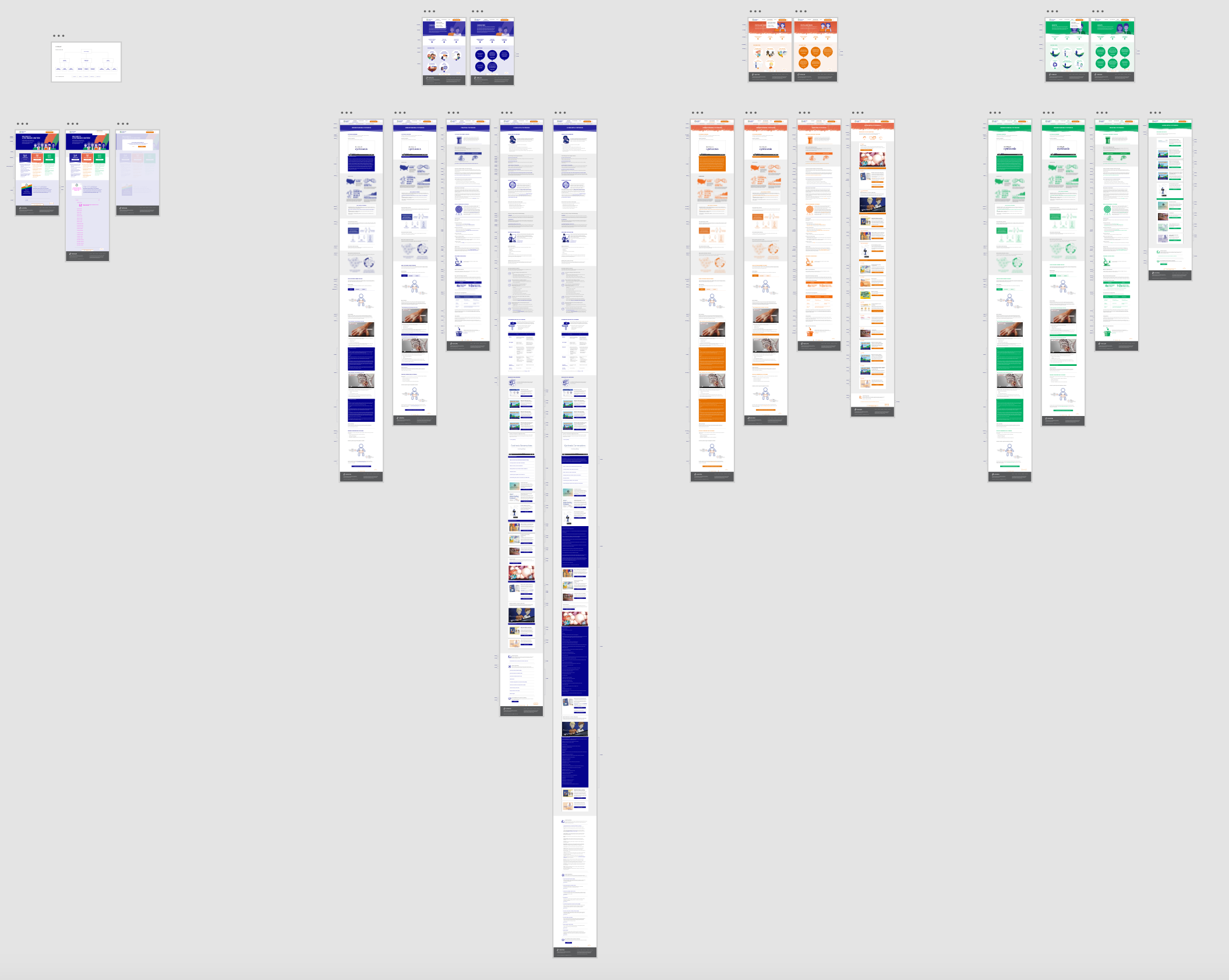
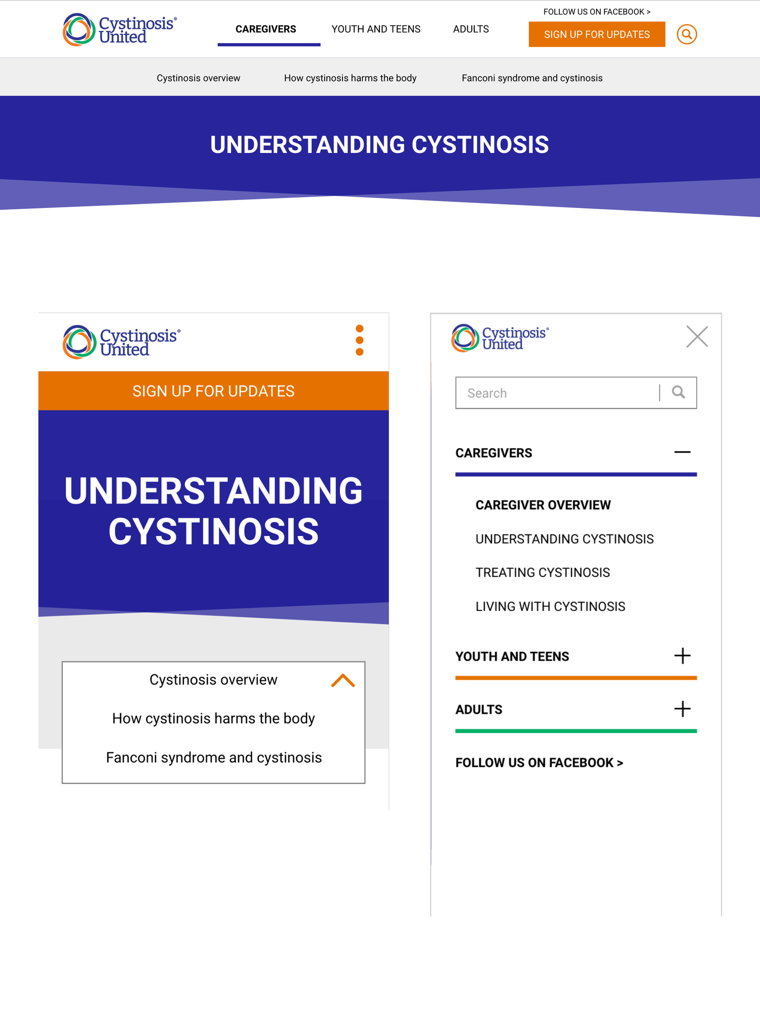
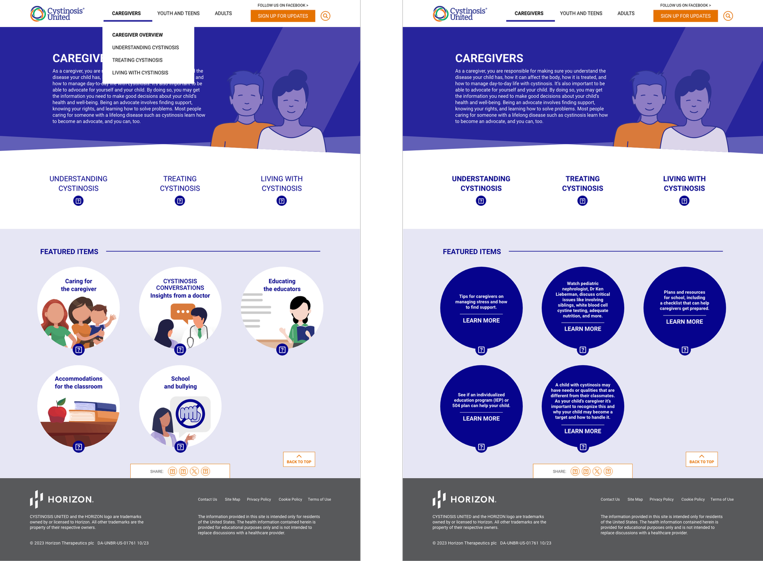
Navigation Architecture
Dual navigation model that adapts seamlessly across desktop and mobile, keeping users oriented throughout long-form medical content.
Interactive Components
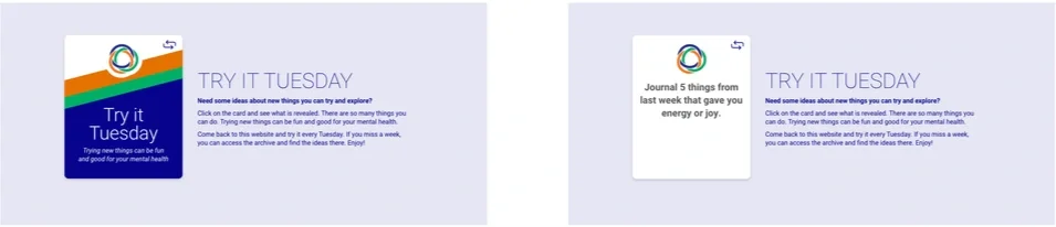
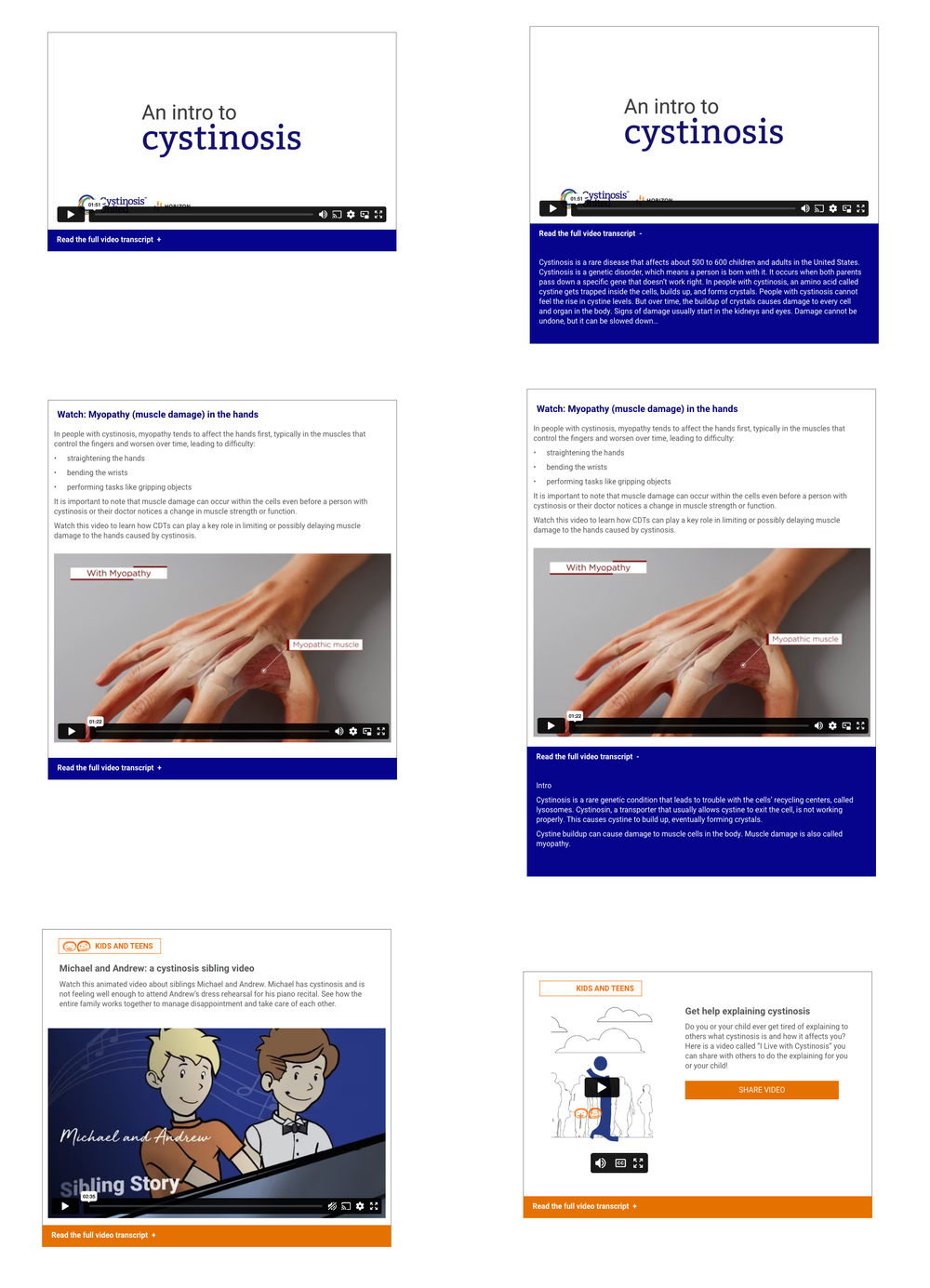
Custom components including accordions, flip cards, embedded videos, and icon-based visuals help simplify complex medical topics and keep users engaged.
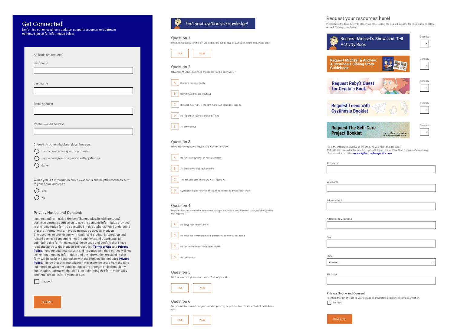
Form Design & Validation
Three forms with logic-driven fields, error states, and accessibility-driven validation ensure accuracy and reduce barriers for families submitting sensitive medical information.
Color Persona Mapping
I performed extensive QA across browsers and devices to ensure speed, accessibility, and design fidelity across pages, states, and content variations.
QA + Performance
Color-coded route system that supports parents, adults, and caregivers with distinct visual cues for clarity.
key higlights
Color System
A persona-based palette system guides users through unique pathways while maintaining consistency across the brand. Color becomes both an emotional cue and a navigational tool.
Custom Navigation
A dual system with a fixed global nav and contextual section navigation that adapts fluidly between desktop and mobile. This ensures every user—regardless of persona—always knows where they are and where they can go next.
Form Design
Three distinct form experiences have been carefully crafted using tailored logic, layered validation processes, and WCAG-conscious design patterns to ensure both clarity and accuracy throughout the user journey.
Interactive Components
Accordions, flip cards, videos, and modular components create layered storytelling and allow complex information to unfold at a digestible pace.
Tabs
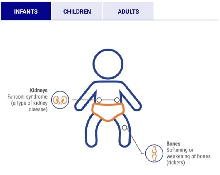
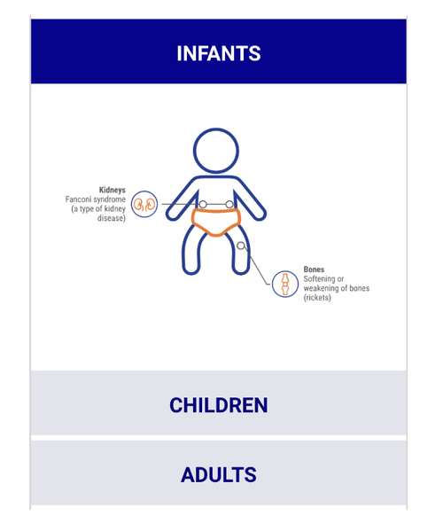
Accordions
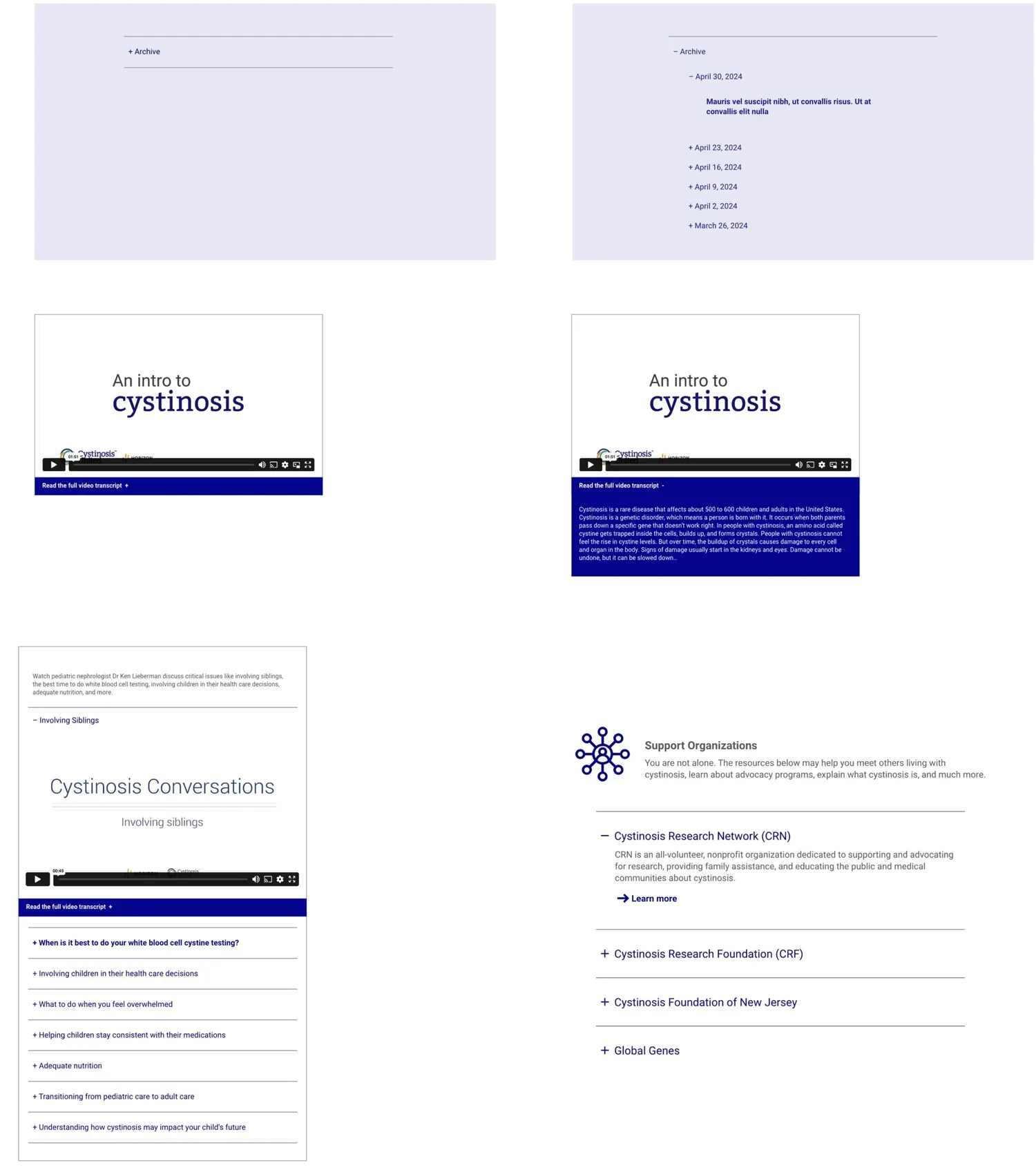
Round Flip Cards
Square Flip Cards
Videos with Transcription
OUTCOME
A polished, mobile-friendly platform that transforms highly technical medical content into a clear, emotionally supportive learning experience.
The updated structure and interaction patterns help users:
understand and retain complex information faster
navigate content paths without confusion
feel emotionally supported through soft visuals and guided flows
access consistent experiences across devices
The redesign brings warmth and humanity to medical education—without sacrificing accuracy.
WHAT I LEARNED
Working within medical, regulatory, and accessibility constraints sharpened my ability to design and develop creatively within tight parameters.
This project reinforced the value of:
building emotionally aware experiences, even in technical contexts
using persona-driven structure to guide information hierarchy
designing interactions that balance clarity, empathy, and precision