UX/UI DEsign | Healthcare Digital Experience | Horizon Therapeutics
CONTACT US PAGE OVERHAUL
A collection of UX projects for Horizon Therapeutics, each designed to bring warmth, clarity, and trust to complex healthcare systems through intentional, human-centered design.
my ROle
UX Research | UX Strategy | Information Architecture | UI Design | Wireframing & Prototyping | Cross-Functional Collaboration
Tools
XD, Crownpeak
Timeline
10 weeks
Deliverables
User audit, layout concepts, responsive wireframes, interactive prototype, developer hand-off documentation.
OVERVIEW
I led the redesign of the global “Contact Us” experience for Horizon Therapeutics — consolidating two separate pages (“Contact Us” + “Locations”) into one streamlined, responsive, and user-friendly interface. The goal: reduce cognitive load, improve accessibility, and create a consistent experience across desktop and mobile.
01
CHALLENGE
User inquiries were distributed across two pages, leading to confusion and inefficient navigation.
Key pain points:
Redundant content and overlapping email/phone listings across pages
Poor mobile readability with dense contact blocks
Lack of clear visual hierarchy between global HQ, regional offices, and contact channels
Internally, the challenge was to build a flexible layout within the existing design system, while ensuring compliance and ease of future updates.
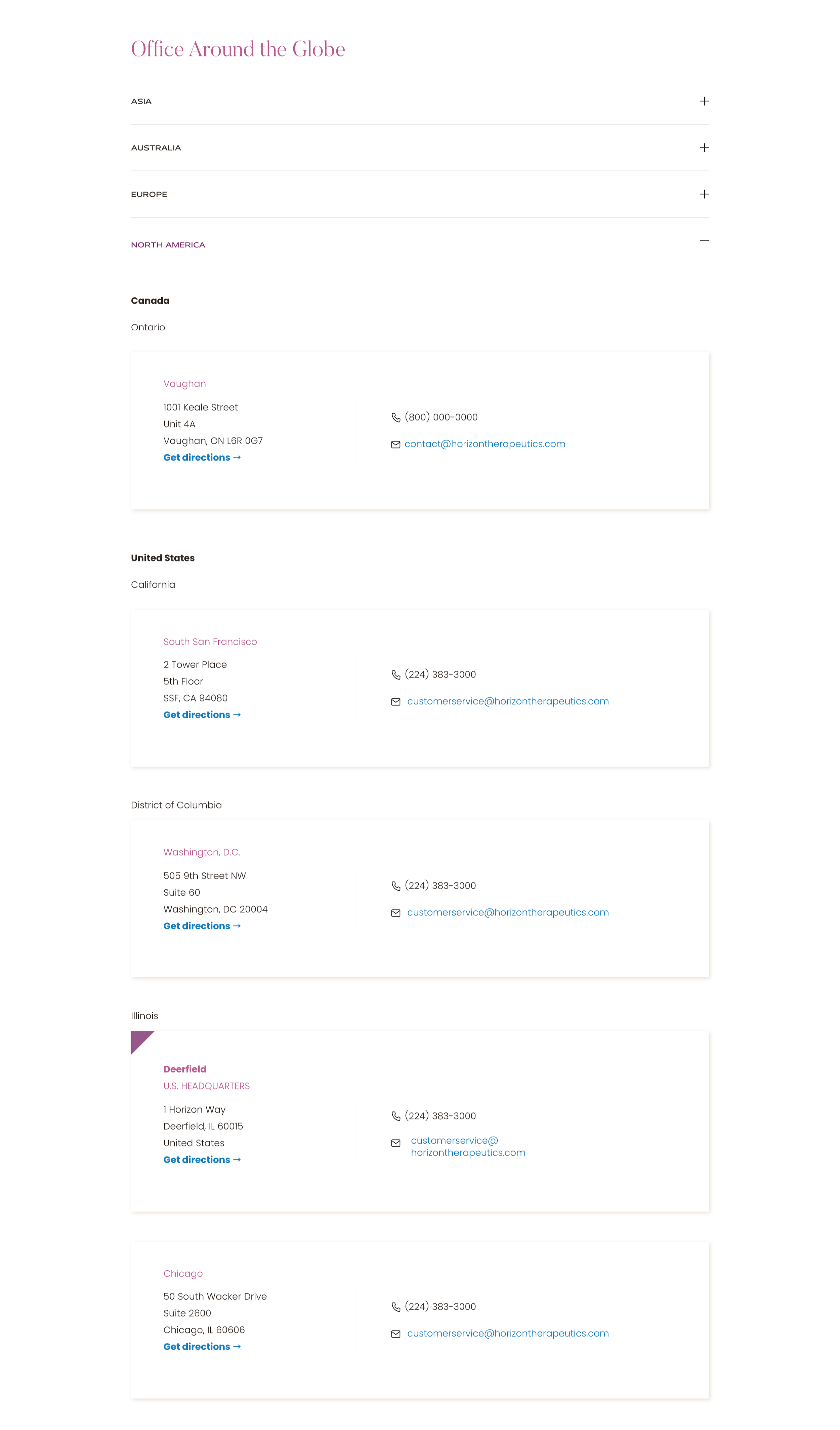
02
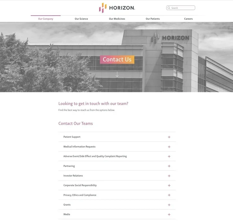
Before Contact us page
GOAL
To create a unified contact page that:
Clearly distinguishes between Global Headquarters, Regional Offices, and Support Channels
Uses responsive, single-column layouts on mobile and modular cards on desktop
Presents contact info with precision and calm—reducing visitor effort and improving clarity
03
RESEARCH FINDINGS
62% of mobile users abandoned before finding a clear contact method due to long scroll and dense format
Offices listed separately confused users — frequent duplication of phone/email entries
Regional contact cards outperformed traditional layout when tested for clarity and scan speed
These insights guided the layout strategy: simplified card-based design + responsive collapse for mobile.
04
PROCESS
I began with a UX audit of 15 leading biopharma contact interfaces to benchmark content structure, interactive patterns, and global localization.
Using those insights, I mapped user flows for both mobile and desktop — focusing on people looking for help vs. locations vs. corporate inquiries.
Wireframes were built in Sketch and tested with key stakeholders (support, medical, compliance).
Finally, I worked with front-end developers to translate the design into Crownpeak components with accessibility tags, optimized for translation and future scalability.
05
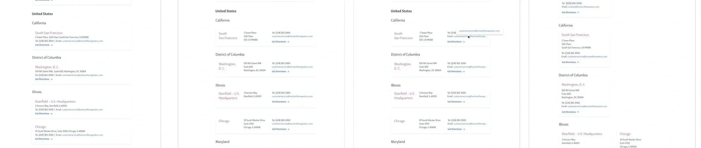
Concept 1:
1 column layout with mailing address in a single line
Concept 2:
3-column layout with extra long email address wrapping around
Concept 3:
3-column layout with ellipses for long email addresses and a hover interaction to see the whole email
Concept 4:
A card layout with the mailing address broken down
STRATEGIC SOLUTION
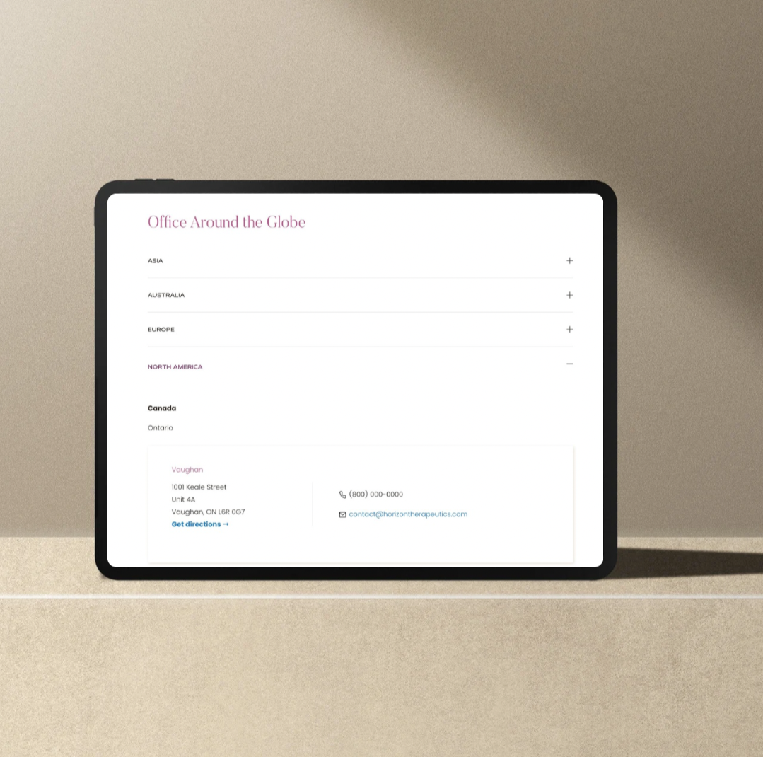
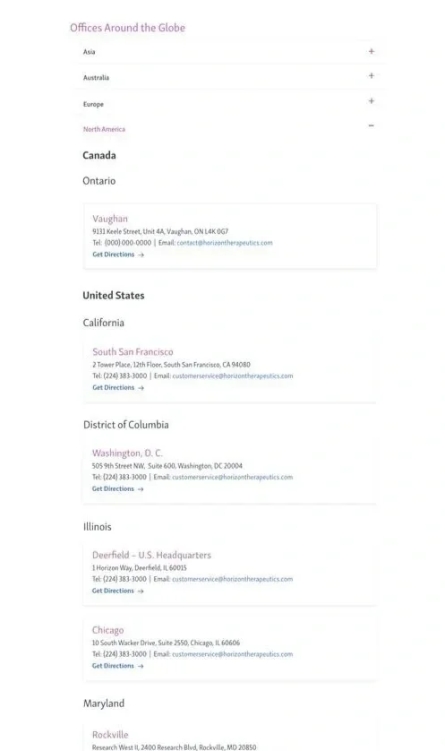
Card layout for desktop with clear typographic hierarchy (Office → Region → Contact)
Accordion sections on mobile for FAQ and location details — minimizing initial load and reducing scroll fatigue
Visual emphasis for Global HQ via a subtle color accent (badge or caret icon)
Consistent component system to ensure future offices or regions can be added without redesign
06
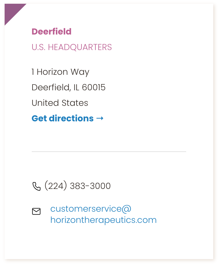
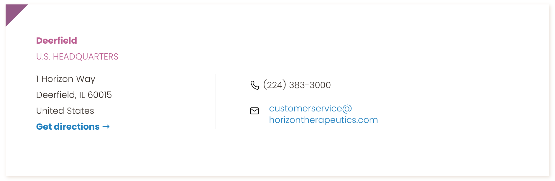
New Contact Us Cards (Mobile & Desktop)
New Contact us page
IMPLEMENTATION
I established field styles and global card templates within the design system, defining variant states for HQ vs regional vs support contacts.
Working with the development team, we implemented these in Crownpeak, ensuring responsive breakpoints and mobile-first performance.
Accessibility audits confirmed all cards met WCAG 2.1 AA contrast and keyboard‐navigation standards.
07
OUTCOME
Consolidated two pages into one streamlined experience, reducing bounce and duplication
Mobile scan time for contact info dropped by ~30%
Internal teams adopted the card-template for future regions, speeding rollout of new offices
The redesign not only improved usability but also established a maintainable module for global contact expansion.
08
REFLECTION
This project reinforced how clarity, structure, and modular thinking are vital in high-visibility corporate portals.
By distilling global contact information into intuitive, card-based layouts, we improved access and usability without sacrificing brand tone or regulatory compliance.
09
FUTURE STATE
The modular contact framework is built for scaling and localization. Future enhancements may include:
Live map integration showing nearest office by user location
Multi-channel routing (chat, SMS) by region
Automated update feed for new offices or translated content
Although Horizon’s web ecosystem was later integrated into Amgen’s platform, this contact module remains a blueprint for enterprise-scale global UX.