UX/UI Designer & Front-End Developer
Horizon Therapeutics Site


Project Summary
Challenge
The Leadership team identified three key areas for improving the user experience on HorizonTherapeutics.com:
Mobile Menu- The menu was difficult to navigate due to a 50% transparent background that hindered readability. Additionally, the menu included an overwhelming number of options and did not utilize the full screen width, causing unnecessary line breaks and a cluttered appearance.
Contact us Page- Information was previously split between two separate pages ("Contact Us" and "Locations"), which created confusion. These needed to be consolidated into a single, well-organized page that presented contact information in a more accessible and digestible format.
Clinical Trials Page- A new page was needed to clearly present frequently sought information about ongoing clinical trials, including details and available locations, to better serve patients and caregivers searching for trial opportunities.
Tools
Sketch
Crownpeak
Timeframe
2-5 months each
Mobile Menu Redesign
Challenge: The existing mobile menu had a semi-transparent background, excessive options, and limited screen utilization, leading to a cluttered and inefficient navigation experience.
Solution: I proposed three distinct concepts:
Concept 1-Expandable/collapsible menu items with a background.

Concept 2- Expand/Collapse Experience with dividers.


Concept 3- Next-page navigation flow.
At the same time, I conducted a market research of mobile menus used by other similar companies in the market to determine best practices. The research confirmed that the next page flow of menu options is the most logical and common way to navigate since it help users hone in the options they are interested in. Also, the research confirmed that it is useful to have the menu icon on the right (based on 95% of sites reviewed) and the search bar in the header (based on 80% of sites reviewed). Additionally, only 5% of the reviewed sites include social media links in the mobile menu so we removed the links. which also helped reduce the content on the screen.
More details about this market research can be found here:
Outcome: The final design streamlined the menu, enhancing readability and user flow.
Contact Us Page Overhaul
Challenge: Information was dispersed across two pages, creating a fragmented user experience.
Solution: I consolidated the content into a single, well-structured page by implementing:
Accordion-style sections to organize FAQs and location details efficiently.
Clearly labeled location cards with collapsible content to streamline navigation and reduce cognitive load.
A responsive, single-column layout for mobile devices, improving spacing, readability, and overall user experience.
Concept 1:
1 column layout with mailing address in a single line
Concept 2:
3-column layout with extra long email address wrapping around
Concept 3:
3-column layout with ellipses for long email addresses and a hover interaction to see the whole email
Concept 4:
A card layout with the mailing address broken down
Mobile:
1-column layout

Location Card Concepts
Outcome: The redesigned page improved information accessibility and user satisfaction.

I also explored various font styles and layout treatments to ensure that key information stood out clearly while maintaining visual balance and consistency across the page. In particular, the U.S. and Global Headquarters needed to be visually distinguished within the location cards. I tested two design approaches: one using a left-aligned caret icon to subtly draw attention, and another using a colored background badge. The caret approach offered a more refined emphasis without disrupting the overall aesthetic, so we chose to move forward with that option.
Clinical Trials Resource Hub
Challenge: Users lacked a centralized, user-friendly location for clinical trial information—including trial locations and eligibility criteria—making it difficult to access critical resources efficiently.
Solution: I implemented a phased approach:
Phase 1: A single-page overview featuring 2–3 highlighted trials and an FAQ section.
Phase 2: Introduction of a card carousel for featured trials, a comprehensive trials list, and detailed trial pages.
Phase 3: Incorporation of a search component for easier navigation.
Phase 4: Addition of filtering options on the trials list page for refined search capabilities.
Due to evolving content availability, resource constraints, and component limitations, requirements continued to iterate throughout the project. Phasing the release allowed us to meet the project deadline while continuing to improve the experience post-launch.
To ensure decisions were user-informed, I relied on UX best practices and requested user interviews to better understand the most relevant information users were seeking. We conducted four rounds of wireframe reviews to test what worked and identify opportunities for improvement. Feedback from these reviews directly informed future phases (3 and 4).
Outcome: This phased rollout enabled continuous testing and refinement, resulting in a user-centered solution that evolved with real feedback and addressed both technical and timeline constraints.
Phase 1- A one-pager that introduces 2-3 featured clinical trials and FAQs.

Phase 2- Includes a card carousel for featured trials, a trials list page, and a trial details page.

Phase 3- Includes Phase 2 features plus a search component.
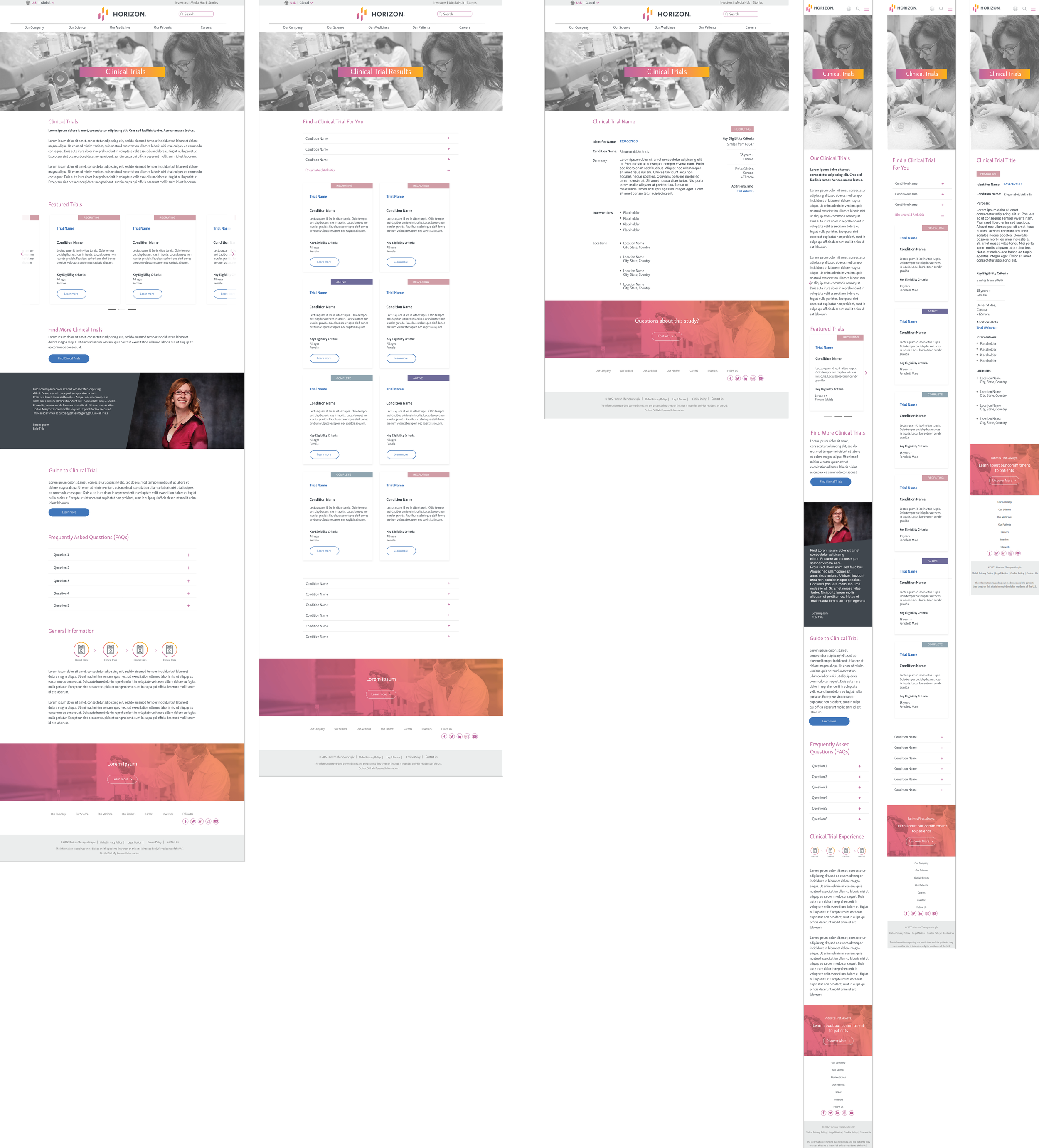
Phase 4- Includes Phase 2 and Phase 3 features plus filters on trials list page.
